

Colour Theory
This tutorial is excerpted from The “Spandex Simplified” line of books by Marie Porter, as well as "Sewing for Skaters and Gymnasts and Dancers... Oh My. All photos, & accompanying tutorial are copyright @ 2000 - Marie Porter, all rights reserved.

When designing a spandex costume for a performance athlete, colour theory is a HUGE consideration. Here's a bunch of help with that!
Colour Theory and Design
Colour is one of your first design considerations, as it will affect your choice of fabric.
Using the athlete’s favourite colour isn’t necessarily the best idea, sometimes it will not suit their skin colouring.
A few guidelines to take into consideration.
Skin Tone
Always hold a fabric up to the athlete’s face to see how it looks against their skin.
- A pale skinned person can look washed out in a really dark colour, and can look ghostly in a light colour. Try to keep it at a happy medium.
- Medium to darker skinned people have a greater choice in what they can wear.
- Another consideration for would be acne. Is acne or facial blemishes a concern? If so, a red or pink suit would not be a good idea, as it would only spotlight the blemishes and make them more pronounced.
Hair Colour
Some hair colours just look better with certain colours than others. A great example of this would be red haired people wearing green.
(Note: red and green are complementary colours, so it’s not just a stereotype- there’s actual chromatology science behind that combo!)
Make sure that the garment colour works with the hair colour. Of course, this is coming from someone with a penchant for dyeing her hair bright turquoise...
Personality
An outgoing person tends to look and feel good in colours that are vibrant, while shy and quiet types usually tend to look and feel better in lighter or more muted colours. This can also be a comfort issue, as some people just don’t feel comfortable wearing loud colours.
To get a general idea of your colour personalities, here’s a rough guide.
Keep in mind that this is not an exact science, but many times, people are surprised at the accuracy. This is paraphrased from something from way back in fashion design school:
Red: Red tends to represent positive, aggressive, passionate people.
Orange: Orange tends to represent social, outgoing people.
Yellow: Yellow tends to represent complicated people. Abstract thinkers, intelligent, and often
idealistic.
Green: Green tends to represent well balanced, realistic people.
Blue: Blue tends to represent cautious, wise, level headed people
Purple: Purple tends to represent passion, mourning, regal people
In addition to actual colour, colour types / vibrance levels also have personality profiles associated with them. This is talking about the saturation or brightness of the actual colours.
Bright: Uncomplicated, “What you see is what you get”, direct personality.
Pastels: Shyness, introversion
Intense: Creativity and independence.
Mid tones: Any extremes in colour personality are tempered by judgment, conservatism.
Subdued: Sophistication and wisdom
Colour Terminology
It might be nice if you knew all the different terms you’re going to hear when it comes to colour, huh?
This definitely helps when it comes to ordering - or describing - fabrics.
A basic rundown of it goes like this:
Hue: This is a colour’s name, what you know it by. Pink, Blue, Red, Yellow, are all Hues.
Value: This talks about the colours appearance - brightness, darkness, or how bright / bold it is.
Tint: The colour produced when you mix a Hue with White. Pink is a Tint of Red.
Shade: The colour produced when you mix a Hue with Black.
Tone: The colour produced when you mix a Hue with Grey. This is done to lessen a colour’s intensity. Think “Toning Down” the colour.
Primary Colours: Red, Yellow, and Blue
Secondary Colours: Orange, Green, and Violet
Tertiary Colours: Red-Orange, Yellow-Orange, Yellow-Green, Blue-Green, Blue-Violet, Red-Violet

I designed this colour wheel for my first book, back in 2000. Still handy now!
Colour Schemes
When using more than one colour, either in colour blocking, appliques, or accessories, you might want to look into using an organized scheme to choose which colours to use. These groupings are known to be pleasing to the eye, as a general rule.
Monochromatic Colour Scheme
The word Monochromatic comes from two Greek words: Monos, meaning single, and Chroma, meaning colour. This colour scheme involves using tints, tones, and shades of any ONE particular colour , together.
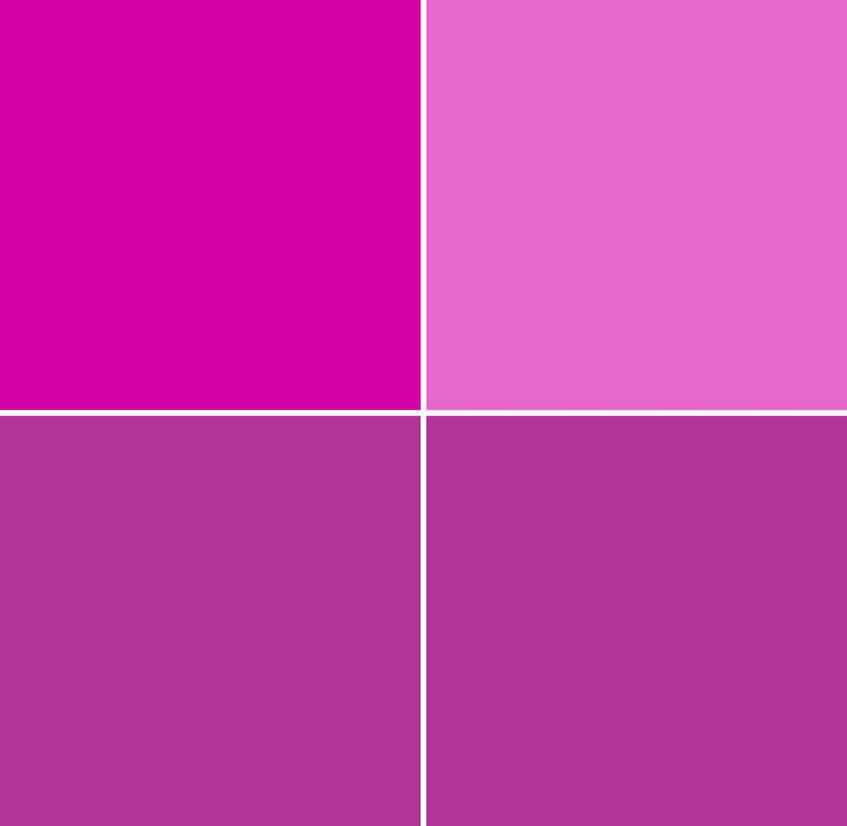
This is a red-violet monochromatic colour scheme.
Analogous Colour Scheme:
An analogous colour scheme involves using colours that are so close to each other on the colour wheel, they don’t create a sharp contrast.
For example: Red, Red- Orange, and Orange, used together, would be an analogous colour scheme.
This allows for a little diversity with use of colour, while still remaining conservative.

Red, Red-orange, and Orange as an analogous colour scheme.
Complimentary Colour Scheme:
This is when you use two colours that are directly opposite each other on the colour wheel.
Examples would include Blue & Orange, Yellow and Violet, Red & Green, etc.

Violet and Yellow is an example of a complementary colour scheme
Split Complementary Colour Scheme:
For a similar effect as the complementary colour scheme, that is more mild on the eyes, you could try a split complementary colour scheme.
For this, you would choose one main colour, for example, Blue.
Instead of using the complementary colour to your main one (orange), you would use the tertiary colours on either side of the complement (Red-Orange and Yellow-Orange).

Blue, Red-Orange, and Yellow-Orange, as a split complementary colour scheme
Triad Colour Scheme:
To create a triadic colour scheme, you would choose 3 colours, shades, tints, or tones that are at equidistant points on your colour scheme.
That is to say, if you were to place an equilateral triangle on your colour wheel, the colours at each of the 3 points would be a triadic colour scheme.
For example: Red, Yellow, and Blue is triadic, so is Violet, Green, and Orange, or yellow-green, blue-violet, and red-orange.
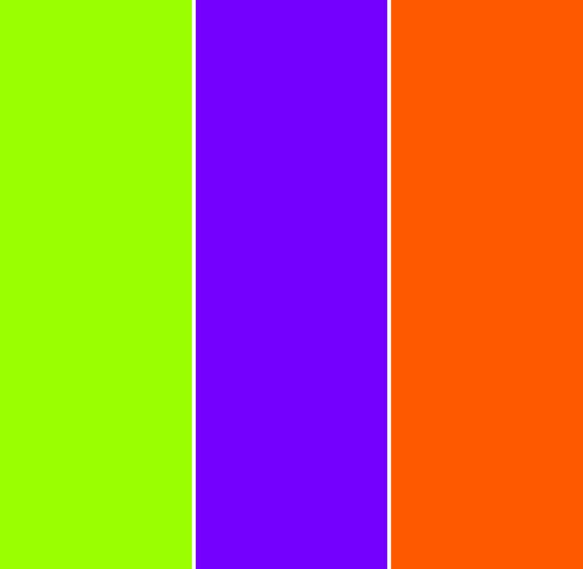
Yellow-green, blue-violet, and red-orange as a triadic colour scheme.
Reading about - or seeing - different colour schemes, you may see some combinations that are familiar to you.
Red and Green, a complementary scheme? Christmas.
That Triadic example pictured? Definitely evokes Halloween.
You may be able to see other examples around you. A lot of sports teams, for example, will make use of these prescribed colour schemes for their logo and marketing.
Choosing a Posing Suit Colour
Now that you’ve had a crash course in general colour theory as it relates to fashion design, let’s talk about posing suits, specifically.
While general colour theory comes in handy for every day dress, and a lot of performance sport costuming, a lot of that theory has to be thrown out the window when it comes to posing suits.
Posing suits have a whole other set of concerns to keep in mind.
Stage Visibility
First of all, you’ll want to avoid pastel colours and white... full stop.
Aside from the fact that tanner has a tendency to stain the suits and can look especially awful / prominent on lighter suits, these colours also get very washed out on stage.
No matter how much you love baby blue... you’re best off to just avoid it for a posing suit!
With pastels eliminated, you still have a lot of colours to choose from.
Your Physique
Your next consideration is your own physique. The better your proportions, the more options you have with colour!
You see, your bikini (or mens’ posing suit, as the case may be) visually divides your body into sections.
For men, this is two sections - upper (torso) and lower (legs) sections.
For women, it’s everything above the bra (arms, shoulders, upper back), everything between the bra and the bottom (abdominal area), and the legs.
This sectioning can make any issues with proportion even more apparent to the judges.
Remember the advancing and receding colours issue, from my Principles of Design post??
This is a great example of how it comes into play.
Advancing colours make the sectioning off of the body even more prominent than just the presence of the suit itself.
This is why physique proportion is so important when it comes to colour.
A competitor with a perfectly proportioned physique can get away with bright colours in a way that someone who is more concerned about their portions can not.
As an example, if a competitor has a long torso with shorter legs, advancing colours will draw attention to this.
So, if you are very confident in your proportions, by all means - pick a gorgeous, bright colour that will really pop on stage if that’s what you want. (Just avoid neons, as they don’t tend to look great under stage lighting!)
For others, it’s usually best to stick with darker colours - jewel tones, deep forest greens, even brown and black.
Distraction
Another consideration: Bright bikinis distract the eye not only figure flaws, etc... but from the body, in general.
When you’re being judged on the physique that you worked so hard on, do you really want it to fade into the background, with your suit as the main attention grabber?
For this reason, many judges prefer dark suits in general, even brown!
The closer to the tan colour your suit is, the easier it is for the judges to scan their eyes over your body, taking in your physique as a whole package... Not as a bright bikini with body parts sticking out of it!
Getting Started with Spandex Costuming
Looking for more posts on the basics of spandex costuming?
How to Measure for Spandex Costuming
Spandex Costuming Tools & Supplies
Spandex Costuming Design Principles
Types of Stretch Fabric for Spandex Costuming
Basic Pattern Alterations
How to Cut Spandex
How to Sew Spandex With or Without a Serger
... and be sure to check out our Table of Contents for an organized listing of all of our posts.
Share the Love!
Be sure to take some pics of your handiwork! If you post it to Bluesky, be sure to tag us - @SpandexSimplified.
Also, be sure to follow me on Pinterest, and subscribe to my Youtube Channel, so you never miss out on any of my nonsense.
Well, the published nonsense, anyway!


How does gold and silver fit in the color wheel theory? I notice lots of rhythmic gymnastics and synchro suits have metallic colors-- are they just supposed to be used as accents?
Also, what about metallic vs normal colors-- for example the shiny metallic blue vs just normal blue color. Are there rules, guidelines, preferences for uses?
That's a really good question, but the answer is kind of... it depends.
I tend to approach silver as a true neutral, as it's basically grey with a shine. Some can have a really subtle tinge of a colour though. It's it's obvious enough to see it (say, you have a really blueish silver), I'd treat it almost like a blue.
Gold *can* be treated as you would a yellow (especially if it's among multiple colours of metallic fabric), but if it's being used against non-metallic fabrics, it almost has a neutral quality.
As for metallic vs non metallic, a lot of that is going to come down to actual usage. If it looks good, go with it - regardless of what the "rules" say!